CrossfadeDrawerLayout 

Many modern applications come with a
Drawer, which is a great pattern to implement one level of navigation to your app, but this only comes with one level, and after opening it will take the whole view.
The CrossfadeDrawerLayout is here to solve this. It alllows to implement a 2 step navigation. By default it does not show up, after the user swipes, or clicks the NavigationIcon it will show the quick navigation, which
only consists out of a profile (if given), icons and badges. Users can quickly choose what they want, without interacting with any additional information. If the user wants to switch his profile, or want have access to additional
functions, he can drag in the MiniDrawer and resize it to a normal Drawer.
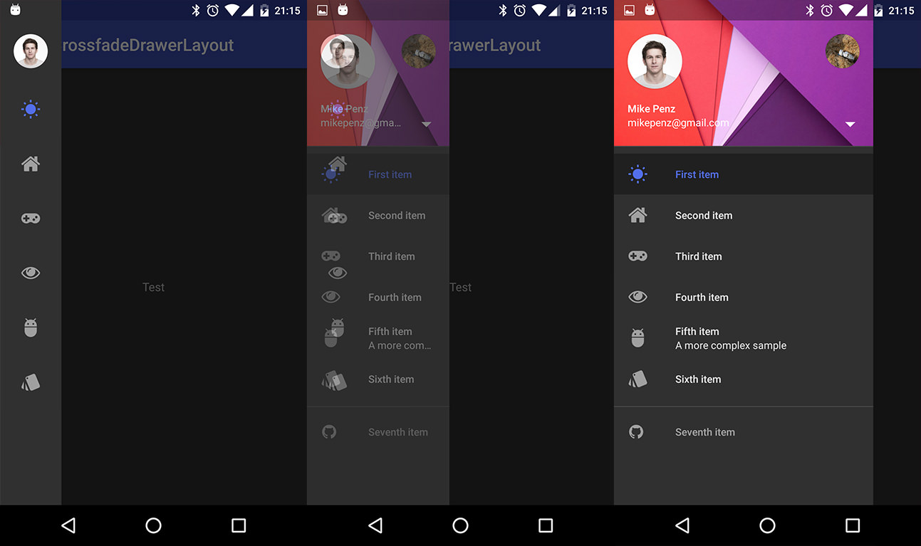
Preview
Screenshots
Include in your project
Using Maven
compile "com.mikepenz:crossfadedrawerlayout:1.0.0@aar"
compile "com.android.support:appcompat-v7:${supportLibVersion}"
How to use
With the MaterialDrawer
crossfadeDrawerLayout = new CrossfadeDrawerLayout(this);

//Create the drawer
result = new DrawerBuilder()
        .withActivity(this)
        .withToolbar(toolbar)
//provide the custom crossfadeDrawerLaoyout
        .withDrawerLayout(crossfadeDrawerLayout)
        .withHasStableIds(true)
//define the width to the width of our smaller view
        .withDrawerWidthDp(72)
//generate the MiniDrawer which is used for the smaller view
        .withGenerateMiniDrawer(true)
//add some items, those are alo automatically added to the MiniDrawer
        .addDrawerItems(
                ...
        )
//the listener which is called when an item inside the drawer or miniDrawer is clicked
        .withOnDrawerItemClickListener(new Drawer.OnDrawerItemClickListener() {
            @Override
            public boolean onItemClick(View view, int position, IDrawerItem drawerItem) {
                return false;
            }
        })
        .withSavedInstance(savedInstanceState)
        .build();

//define maxDrawerWidth (this is the width in the complete opened state)
crossfadeDrawerLayout.setMaxWidthPx(DrawerUIUtils.getOptimalDrawerWidth(this));

//add second view (which is the miniDrawer)
MiniDrawer miniResult = result.getMiniDrawer();
//build the view for the MiniDrawer
View view = miniResult.build(this);
//set the background of the MiniDrawer as this would be transparent
view.setBackgroundColor(UIUtils.getThemeColorFromAttrOrRes(this, com.mikepenz.materialdrawer.R.attr.material_drawer_background, com.mikepenz.materialdrawer.R.color.material_drawer_background));
//we do not have the MiniDrawer view during CrossfadeDrawerLayout creation so we will add it here
crossfadeDrawerLayout.getSmallView().addView(view, ViewGroup.LayoutParams.MATCH_PARENT, ViewGroup.LayoutParams.MATCH_PARENT);

//define the crossfader to be used with the miniDrawer. This is required to be able to automatically toggle open / close
miniResult.withCrossFader(new ICrossfader() {
    @Override
    public void crossfade() {
        crossfadeDrawerLayout.crossfade(400);
        //only close the drawer if we were already faded and want to close it now
        if (isCrossfaded()) {
            result.getDrawerLayout().closeDrawer(GravityCompat.START);
        }
    }

    @Override
    public boolean isCrossfaded() {
        return crossfadeDrawerLayout.isCrossfaded();
    }
});
Developed By
- Mike Penz
License
Copyright 2016 Mike Penz

Licensed under the Apache License, Version 2.0 (the "License");
you may not use this file except in compliance with the License.
You may obtain a copy of the License at

   http://www.apache.org/licenses/LICENSE-2.0

Unless required by applicable law or agreed to in writing, software
distributed under the License is distributed on an "AS IS" BASIS,
WITHOUT WARRANTIES OR CONDITIONS OF ANY KIND, either express or implied.
See the License for the specific language governing permissions and
limitations under the License.